Tuesday, 21 October 2014

Three adverts to analysis

 This poster is really good because the background is similar to the design of the shoe so it makes the shoe stand out. Its really well done because it says stand out and the shoe has random colors so you would stand out. The target audience would be kids and teens, most likely girls because of the style of shoe, but its also unisex because of the camo color. The company who created this shoe might have used photoshop to put the picture of the shoe onto the poster and added the writing.
The poster for this shoe is alot more creative as it shows all of the colors you could get the shoe in, the white background makes the shoe really stand out with all the colors on it. The quote also adds to the poster. To make this the company would most likely use photoshop to add the paint and make it really bright. The target audience is probably aimed at children, teens and young adults. If i was going to make a poster i would use the way the have used color to make it really stand out to get peoples attention. Its showing all the colors you would get in the shoes and how you would stand out from everyone as the shoe is so bright and colorful.
This poster is very plain yet very effective, its aimed at younger children and teens as its really simple but the bright colours draw your eyes to it. the cartoon looks really good against the background because the bright colours go well together. To create the poster thy probably would have used illustrator to create the base lines and the outline of the leg and shoe but they also could have used photoshop to add the detail to the shoe and add in the logo. i really like this poster and if i was to make one i would use the same kind of design as this as even though its rather simple it still looks really good.


Friday, 17 October 2014

Shoe homework


Evaluate and comparison of illustrator vs photoshop.

C Grade.

People who create carton movies would be more likely to use illustrator as it has more of cartoon side,  because you can make shapes, curves and lines which would be good to create cartoon whereas more complex films with actors would most likely be on photoshop as its easy to photoshop things for a movie poster, other people who would use it might be photographers as they might use it to edit their photos. although, people who create video games might use both, they might use illustrator for creating the characters and possibly photoshop for creating the game cover or some backgrounds for the game.

Photoshop use pixels as it has the pictures in tiny pixels which stay so when you zoom in or make the photo larger it will stay like the original and not go burly, but if you zoom in too far he pixels will be visible, the squares all add up to make the actual picture, whereas vectors are like a sheet of paper with no pixels whatsoever. so vector are good at making animations as they won't have any of the pixels.

On photoshop i used it to create a unrealistic image, by using certain tools sou can crate an image which looks like the photos are together, so yo could photoshop a house onto an island and make it look like the house was there, if our really skilled you cold photoshop people together.
On illustrator i created a timeline of a logo, i used the line tool and shape too to create and timeline which looked like a movie reel and the text tool to add the dates, it then i brought the to together, i the used photoshop to crop some logos to add to my timeline, when i had made the timeline  i bought them back together by putting my timeline onto photoshop and placed it into a picture of the museum go brands and edited my photo so it looked like it was in he museum.

On photoshop i leant how to use lots of the tools, like... the text tool, the magic wand tool, the magnetic lasso tool, the marquee tools, the brush tool, the crop tool, the zoom tool and how to add and take away layers, i also learnt a few tools on illustrator, the selection tool, the type tool, rectangle tool and the line segment tool, i also leant how to create things on them both as originally i didn't know how to use them but now i know how to use most of the tools.

I gained alot of ideas, now i know what most of the tools do you could create lots of different things, from using photoshop to create posters for movies or books to using illustrator to create a cartoon or maybe even using both to create a short movie, you could use them both its lots different ways, mainly for media reaped things though.

I enjoyed using illustrator to create the timeline, my favorite things on it where creating the timeline because i found out that you could use the line, curve and shape tools to create lots of different things, and i also liked the way you could move the curves a certain way to change the way it curved. On photoshop i enjoyed making the eric jonasson inspired picture as we got to be really creative and create what ever we wanted and it was apt of fun.

I found that when we created the timeline on illustrator that the background changed alot and i had to keep changing it back to the original color but after while i changed it and clicked this icon and it stayed the way it was meant to be. On photoshop i found that the first stage of creating the eric work hard but once i had done some of it i found the rest of it rather easy.

                                                                                                                                                  vector and pixels.


B/A Grade.


The advantage of using illustrator is that you can create lines, squares and other shapes easier and quicker than using photoshop, although on photoshop you can create very different images but using all the tools, you could use it to just edit a photo or you could use it to create more complex images like eric's work.

The drawbacks are if you had never used the programs you probably wouldn't be able to do much as on it as you wouldn't know what to do because it doesn't come wit instruction so you would end u looking on the internet, ut if you knew what you were doing it would be alot easier but sometimes when your trying to create a picture the tools might to be capable of doing war you wanted to do so you wouldn't be able to finish the picture.

I would like to know how we can use them together to make animations,  so we could possibly make a character or object on illustrator and then put them into photoshop and make an animate and vice-versa.

I feel quite confident on the programs but i would like to learn how to use just a few more tools.


My work.


Tuesday, 14 October 2014

My poster in museum

My Poster.

I think that a younger audience would be attracted to my poster as it is a bright color which usually attracts younger children as older people might be more invested in darker things and kids would be drawn to it, younger children might also be attracted to it as it is universal which is a film company which children and teens watch, although some adults would watch it too. The design of it is a movie reel as its based on movies because universal is a company which creates movies, usually which people rather than cartoons.

How I Created It.

I created this by using photoshop, i copied and pasted the poster onto a picture from the museum of brands and then put it in the area of where it would go and adjusted the size, secondly i clicked on edit and went down to transform, once i had done that i held down the transform option and went down t distort, once i had done this i went back to the poster, held down shift, and stated to move it to make it look almost like it was against the wall like the poster that was there before then ticked it and i was finished. I think it would look better if i adjusted to color to make it look darker and have sunlight on to fit in with the other pictures.


Monday, 13 October 2014

Peer Review

Peer Assessment 
1. The poster design suits the logo. you have been successful in illustrator because it looks good.
2. I think you have used illustrator in a creative way because you have made the background in a good way. And the logo suits the background.
3. You could of copy and pasted the boxes in the film reel so it could possibly look better 

universal logo timeline- illustrator

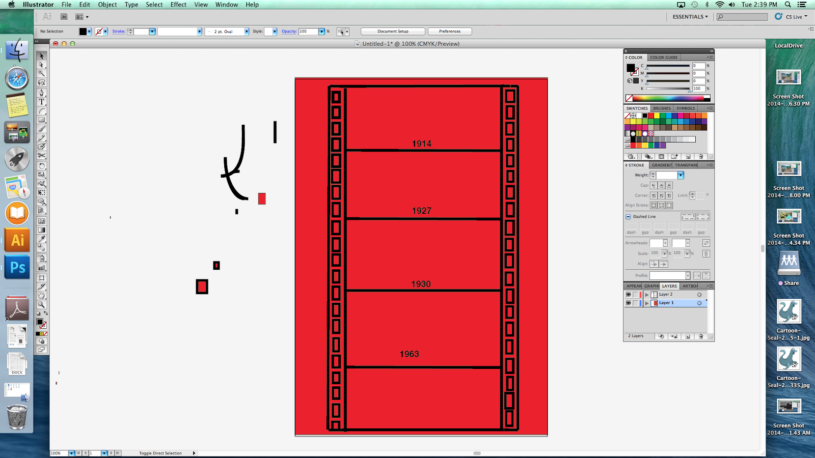
To start i got my first layer of red, which is the background, then i got my second layer and started to add my lines to start my timeline using the 'line segment tool' this was the start of the timeline. my timeline is based on a movie reel as my logo is universal which is a company which creates movies.
After i had got my main lines i started to work on detail by doing the rectangles down the side, this was to add more detail so you would be able to tell what the timeline was based on. To add the rectangles i used the rectangle tool.
 Eventually i finished the rectangles i got around to adding in the dates, this way you would be able to tell what times the logos started and ended, i placed them so i would still have room for my logos. To add the writing i used the type tool.
 I then started to get and add my logos, on photoshop, i used the magnetic lasso tool, to select the photo and the copied the logo and pasted it into illustrator.


Then i did all the other logos and pated them and moved then into the correct place using the selection tool. my work was then completed, and i can show how i did my work by taking screenshots as i went.

Sunday, 12 October 2014

Illustrator homework

This penguin created on illustrator is simple but also very effective, it looks good because you can easily tell its a penguin and its very well create for a first try. this penguin could be used for different things, e.g a logo, a book, a picture for a notepad or pencil case or just used as a picture in someones room, although it is plain and simple it still looks very good.